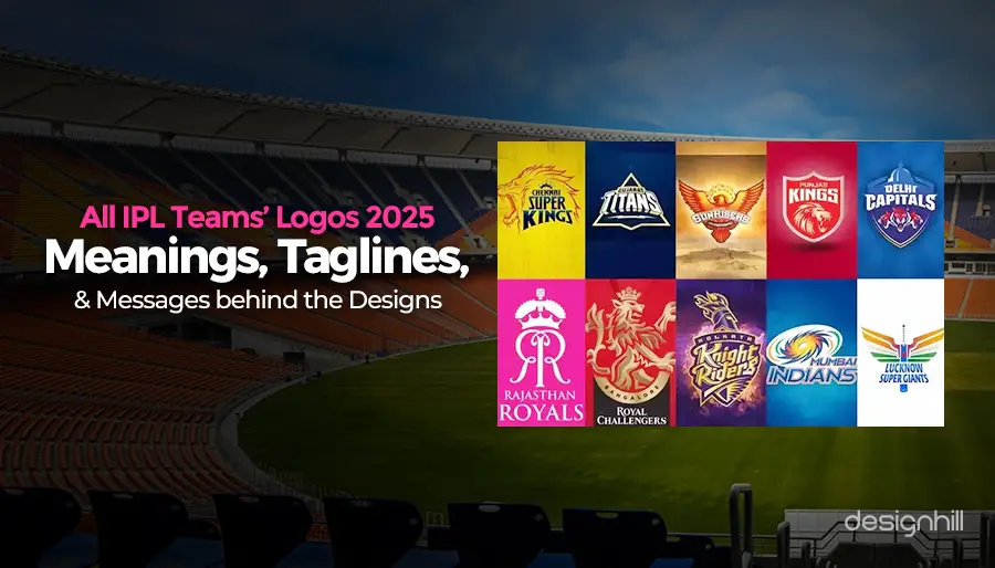
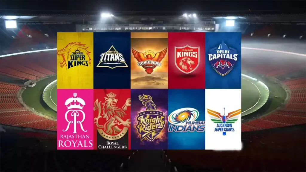
The Indian Premier League (IPL) has evolved into more than just a cricket tournament. It’s now a global entertainment brand where teams are not only judged by their on-field performance but also by their visual identity, merchandising, and fan engagement. Among the most prominent branding elements are the IPL Team Logos—distinctive symbols that represent the soul of each franchise.
In this long-form guide, we will explore the IPL Team Logos 2025, decode their meanings, trace their evolution, analyze their visual strategies, and compare their branding effectiveness across teams. This comprehensive article is tailored to meet Google’s Helpful Content Guidelines, providing detailed, unique, and informative insights that go beyond superficial design descriptions.
Also Read: Top Run Scorers in IPL 2025 – Full List with Stats
Why IPL Team Logos Matter in 2025
The Shift from Cricket to Cricketainment
Over the years, the IPL has shifted from a purely sports-oriented league to a fully commercialized and entertainment-rich event. Franchises operate like global brands, focusing equally on performance, marketability, and storytelling. In this shift, logos have become essential tools of brand communication.
Visual Identity as Emotional Connect
Each IPL team has built its identity through:
- Team colors
- Logos and mascots
- Jerseys and slogans
These visual assets help fans identify with teams. The IPL Team Logos 2025 are not just artworks; they are emblems of pride, legacy, and cultural representation. Whether it’s CSK’s lion or SRH’s phoenix, these symbols carry emotional weight and cultural relevance.
IPL Team Logos: Deep Dive into Meaning & Symbolism
Let’s analyze the meaning behind IPL team logos of each franchise in 2025. Each logo is a thoughtful blend of regional pride, team ethos, and marketing strategy.
Also Read: History of IPL Team Names and What They Represent
Chennai Super Kings (CSK)
- Main Symbol: Roaring lion
- Color Scheme: Yellow and blue
- Meaning: Represents power, courage, loyalty, and royal legacy linked to Tamil culture and the Chola dynasty.
- Brand Insight: The lion projects confidence and leadership. It reinforces CSK’s brand as a consistent and fearless team.
Check Official Website: Chennai Super Kings
Mumbai Indians (MI)
- Main Symbol: Sudarshan Chakra
- Color Scheme: Blue and gold
- Meaning: Symbolizes speed, divine protection, balance, and energy.
- Cultural Link: Deeply connected to Indian mythology, enhancing emotional resonance with fans.
Check Official Website: Mumbai Indians
Royal Challengers Bengaluru (RCB)
- Main Symbol: Majestic lion with a crest
- Color Scheme: Red, black, and gold
- Meaning: Projects bravery, aristocracy, and boldness.
- Design Evolution: Switched to a more minimalist and modern look in 2020, aligning with international sports branding trends.
Check Official Website: Royal Challengers Bengaluru
Kolkata Knight Riders (KKR)
- Main Symbol: Warrior helmet with flames
- Color Scheme: Purple and gold
- Meaning: Implies valor, fantasy, and a warrior’s resolve.
- Fan Connection: Strong fantasy elements make it popular among younger demographics.
Check Official Website: Kolkata Knight Riders
Delhi Capitals (DC)
- Main Symbol: Roaring tiger under a heritage dome
- Color Scheme: Blue and red
- Meaning: Reflects leadership, strength, and pride in Delhi’s culture.
- Rebranding Note: Complete overhaul from Delhi Daredevils in 2019. One of the most successful rebranding efforts in IPL.
Check Official Website: Delhi Capitals
Know More About: Delhi Capital – Team, Full Squad, Players Profile
Sunrisers Hyderabad (SRH)
- Main Symbol: Phoenix-like eagle
- Color Scheme: Orange and red
- Meaning: Signifies rebirth, fire, and ambition.
- Emotional Value: Fans see it as a symbol of the team rising stronger after every fall.
Check Official Website: Sunrisers Hyderabad
Rajasthan Royals (RR)
- Main Symbol: Two royal lions with Rajasthani swords
- Color Scheme: Royal blue and gold
- Meaning: Embodies honor, pride, and regal tradition.
- Cultural Identity: Deeply linked to Rajasthan’s warrior heritage and kingship.
Check Official Website: Rajasthan Royals
Punjab Kings (PBKS)
- Main Symbol: Bold lion head
- Color Scheme: Red and gold
- Meaning: Denotes fearlessness, simplicity, and boldness.
- Design Update: Shifted from a shield-like design to a clean, modern logo in 2021.
Check Official Website: Punjab Kings
Gujarat Titans (GT)
- Main Symbol: Triangle mountain peak with lightning
- Color Scheme: Navy blue and gold
- Meaning: Conveys determination, peak performance, and innovation.
- Launch Year: Introduced in 2022 as a symbol of Gujarat’s resilience and growth.
Check Official Website: Gujarat Titans
Lucknow Super Giants (LSG)
- Main Symbol: Wings flanked by Ashoka Chakra
- Color Scheme: Tricolor gradients and blue
- Meaning: Represents patriotism, ambition, and flight to success.
- National Symbolism: Designed to resonate with fans across India, not just UP.
Check Official Website: Lucknow Super Giants
Evolution of IPL Logos Over the Years
IPL logos have changed significantly since 2008, adapting to modern aesthetics, digital platforms, and fan expectations.
Teams That Rebranded:
- Delhi Daredevils → Delhi Capitals (2019)
- Kings XI Punjab → Punjab Kings (2021)
- RCB Logo Revamp (2020)
These IPL franchise design evolutions show that rebranding helps teams stay visually fresh and relevant in an ever-changing entertainment space.
Design Trends:
- Shift from complex to minimal designs
- Bold typography and sharp color contrasts
- Logos optimized for mobile and app formats
Related Resource: How Rebranding Impacts Sports Teams Globally – Forbes
IPL Team Logos 2025: What’s New?
In 2025, while no team has made major overhauls, subtle design refinements have occurred:
- Font boldness increased for better visibility
- Some teams adjusted color tones for digital clarity
- Jerseys aligned more closely with logo colors for brand cohesion
These adjustments reflect the rising trend of sports branding minimalism. With increasing smartphone viewership and social media consumption, logos are now crafted with multi-platform visibility in mind.
Suggested Watch: IPL 2025 Team Jersey Launch Highlights – YouTube
IPL Team Logo Comparison: Full Analysis
Design Style, Themes, and Symbolism
| Team | Style | Main Symbol | Color Psychology | Brand Emotion |
| CSK | Traditional | Lion | Confidence, Victory | Leadership, Legacy |
| MI | Mythological | Chakra | Spirituality, Stability | Balance, Power |
| RCB | Regal Modern | Lion | Passion, Authority | Prestige, Strength |
| KKR | Fantasy | Helmet | Mystery, Royalty | Aggression, Showmanship |
| DC | Urban Heritage | Tiger + Dome | Energy, Structure | Pride, Unity |
| SRH | Mythical | Phoenix | Energy, Rebirth | Rise, Resilience |
| RR | Cultural | Lions + Swords | Loyalty, Nobility | Legacy, Honor |
| PBKS | Minimal Bold | Lion Face | Simplicity, Passion | Grit, Boldness |
| GT | Futuristic | Peak + Bolt | Innovation, Power | Freshness, Growth |
| LSG | Nationalistic | Wings + Chakra | Patriotism, Speed | Vision, Flight |
Also Explore: Indian Cricket Team – Full Details, History, Players, Records, Achievements, Coaches & Team Updates
Fan Poll: Best Logo in 2025
Engage readers by asking:
“Which team do you think has the most powerful logo in 2025? Comment below and let your voice be heard!”
IPL Logo Design Strategy: How Teams Build Identity
Branding Goals:
- Instant recognition
- Cultural resonance
- Multi-platform visibility (TV, mobile, merch, AR/VR)
Execution:
- Professional design agencies
- Market research
- Global sports branding benchmarks
Behind the Scenes: How Sports Logos Are Made – DesignWeek UK
Team Color Psychology in IPL Logos
Colors play a subconscious role in how fans connect with teams:
- Yellow (CSK): Energy, Optimism
- Blue (MI, DC): Trust, Stability
- Red (RCB, PBKS): Excitement, Power
- Orange (SRH): Action, Enthusiasm
- Purple (KKR): Luxury, Creativity
- Navy (GT): Intelligence, Strength
- Tri-color (LSG): National Unity, Motivation
These IPL team color meanings ensure that logos emotionally align with fan psychology.
Also Read: Psychology of Team Colors in Sports
IPL Logos vs Global Cricket Logos
IPL teams have set a new standard for cricket branding worldwide:
- More emphasis on storytelling
- Frequent updates for modern appeal
- Balance between regional emotion and global trends
Compare With: Top 10 Cricket Logos Worldwide – ICC Insight
Frequently Asked Questions (FAQs)
Q1. What do IPL team logos 2025 mean?
Ans. Each logo is crafted to represent the team’s culture, heritage, and competitive spirit.
Q2. How have IPL logos changed over time?
Ans. From heavy motifs to sleek designs, IPL logos evolved for digital relevance.
Q3. Which IPL logo is the best in 2025?
Ans. Fans favor RCB, MI, and SRH for strong symbolism and visual impact.
Q4. Why do teams change logos?
Ans. To align with new branding goals, improve merchandise appeal, or update their image.
Q5. How are IPL logos designed?
Ans. With expert branding consultants, color psychology, and extensive fan feedback.
Conclusion: IPL Logos as Identity Pillars
The IPL team logos 2025 are more than sports symbols; they are storytelling tools crafted to inspire, connect, and represent. From mythical symbols to patriotic designs, each logo has been carefully built to stand the test of time and trends.
As the IPL continues to expand globally, its team logos will remain key touchpoints for fans. The way they evolve tells us more about branding in modern cricket than any jersey ever could.
Drop your vote below and let us know which IPL team logo you admire the most in 2025. Don’t forget to share this article with fellow cricket fans!
I know of the fact that currently, more and more people are increasingly being attracted to cameras and the subject of images. However, being a photographer, you should first commit so much of your time deciding the model of digicam to buy along with moving via store to store just so you could buy the most economical camera of the brand you have decided to decide on. But it does not end now there. You also have take into consideration whether you should buy a digital digicam extended warranty. Thanks a lot for the good recommendations I accumulated from your weblog.
Can you be more specific about the content of your article? After reading it, I still have some doubts. Hope you can help me.
Hello my family member! I want to say that this article is amazing, nice written and come with approximately all significant infos. I would like to see more posts like this.
Thank you for your sharing. I am worried that I lack creative ideas. It is your article that makes me full of hope. Thank you. But, I have a question, can you help me?
Can you be more specific about the content of your article? After reading it, I still have some doubts. Hope you can help me.
Thanks for sharing. I read many of your blog posts, cool, your blog is very good.
Your point of view caught my eye and was very interesting. Thanks. I have a question for you.